View Class: SelectionInTreeView
Spec Class: SelectionInTreeViewSpec
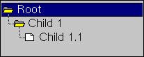
The Tree List Widget is used to display a hierarchical
list.
| ID | Unique symbolic name (ID) of the label.
This ID can be used by the application to access the widget via "builder>>componentAt:#ID". |
| Model | Aspect selector or binding for the widgets model.
Typically, the name of a method implemented in the application, which returns the model. The model can be either a SelectionInTree instance (which holds both the tree and the selection), or a ValueModel* instance, holding the selection alone. |
| Root | Aspect selector or binding for the root of the tree.
Typically, the name of a method implemented in the application, which returns the trees root. |
| Hierarchical List Editor | Opens a Hierarchical List Editor to generate the above method as one returning a constant tree. |
| Popup Menu Selector | Aspect selector or binding for the building
of a popup menu for the list widget.
It should return a menu spec or a menu. |
| Popup Menu Performer | Aspect selector or binding for sending
the messages of the popup menu items to an object.
It should return an object which is able to receive the messages as specified in the menu items. If blank, the application gets the menu messages. |
| Menu Editor | Opens a Menu Editor on the popup menu spec. |
| Vertical Scroll Bar | Turns on/off that the list widget provides vertical scrolling capabilities. |
| Vertical Mini Scroll Bar | Turns on/off that the list widget
uses a small vertical scroll bar.
This attributes can only be set, if the attribute Vertical Scroll Bar is turned on. |
| Horizontal Scroll Bar | Turns on/off that the list widget provides horizontal scrolling capabilities. |
| Horizontal Mini Scroll Bar | Turns on/off that the list widget
uses a small horizontal scroll bar.
This attributes can only be set, if the attribute Horizontal Scroll Bar is turned on. |
| Auto Hide | Controls autoHiding of scrollbars.
If on, scrollbars hide themself, if the contents is smaller than the scrolled view. If off, scrollBars never hide themSelf. If set to default, the autoHide feature is controlled by the viewStyle and scrollbars behave "natural" for the operating system. (true for windows, false for most unix-styles). |
| Font | Defines the font style of the label.
After selecting the check toggle the font style can be chosen by selecting one of the Family/Face/Style/Size buttons. If no font style is selected, the widget takes its default font style from the style sheet. |
| FG-Color | Defines the foreground color of the label.
After selecting the check toggle the foreground color can be chosen by selecting the desired colored button. If no color is selected, the widget takes its default foreground color from the style sheet. |
| BG-Color | Defines the background color of the label.
After selecting the check toggle the background color can be chosen by selecting the desired colored button. If no color is selected, the widget takes its default background color from the style sheet. |
| Border | Defines the width of the border. |
| Level | Defines the width of the 3D-border.
Positive values provide a raising, negative values provide a lowering of the widget. |
| Lines | Controls if connecting lines are displayed. |
| Root | Controls if the trees root should be shown. |
| Indicators | Controls, if [+] / [-] indicators should be shown, indicating if a tree item has subitems (subItemIndicators). |
| Root Indicator | Controls, if a [+] / [-] subItem indicator should be shown for the root item. |
| Allow multiple selections | If off, only a single item may be selected,
If off, multiple items may be selected (shift-click), and the selection will consist of a collection. |
| Highlight | Controls how a selected item should be displayed.
With line highlight style, the complete line is highlighted. With label, only the items label is highlighted. |
| Initially Disabled | Turns on/off that the widget is initially disabled. |
| Initially Invisible | Turns on/off that the widget is initially invisible. |
| Can Tab | Turns on/off that the widget can be reached by tabbing. |
| Enable | Aspect selector or binding for en-/disabling
the widget.
It should return a - Boolean instance** (only for static behavior)
A value model is used to provide a dynamically changing of the ability of the widget. |
| Selected | Method invoked when the selection changes.
This defines the name of a method in the application, which will be invoked whenever the selection changes. If left empty, no callBack is made into the application
|
| SelectCond | Method invoked to ask if selection is allowed.
This defines the name of a method in the application, which will be invoked before a selection is made. If that method returns false, the item is not selected. The selector may be for a 0-arg or a 1-arg method; if its a 1-arg methodName, the node which is about to be selected will be passed as argument. This gives the application complete control over the selection. If left empty, selections are always allowed. |
| Dbl-Click | Method invoked on double click.
This defines the name of a method in the application, which will be invoked whenever the user double clicks on an item. (unless the validate-double-click method returned false) If left empty, no callBack is made into the application
|
| Validate Dbl-Click | Method invoked before a subtree is opened
via double click.
This defines the name of a method in the application, which will be invoked whenever the user double clicks on an expandable item. If the method returns false, the node will not be expanded and no double click action will be performed. If left empty, double click actions are always performed. |
| Validate Expand | Method invoked before a subtree is expanded
via double click.
This defines the name of a method in the application, which will be invoked whenever the user double clicks on an expandable item. If the method returns false, the node will not be expanded. If left empty, expandable nodes will always be expanded upon double click. |
The following methods allow for lazy trees to be managed easily;
Lazy trees are computed only as far as required for the graphical
display; i.e. subtrees for invisible nodes are not created.
In a lazy tree, items are initially built with unspecified contents,
nil label, icon and no child information.
Whenever that information is required by the widget, a corresponding callback
is made to the application, to return the missing information.
Lazy trees are especially useful, if the tree setup is expensive w.r.t.
cpu-time or i/o time. A concrete example is a fileSelection tree or a database
browser, where it may take a long time to gather all the subtree information.
With a lazy tree, these slow accesses will be delayed until the user expands
the corresponding nodes.
| Contents | Method invoked to compute a nodes contents. |
| Label | Method invoked to compute a nodes label string. |
| Children | Method invoked to compute a nodes set of children. |
| Icons | Method invoked to compute a nodes icon image. |
* = ValueHolder, AspectAdaptor, BufferedValueHolder,
RangeAdaptor, TriggerValue
** = true, false
 see document
"Implementing Drag and Drop"
see document
"Using the Help Tool"
see document
"The Layout of the Widgets"
see document
"Implementing Drag and Drop"
see document
"Using the Help Tool"
see document
"The Layout of the Widgets"
![[stx-logo]](../../../icons/stx.gif)
Copyright © 1998 eXept Software AG, all rights reserved