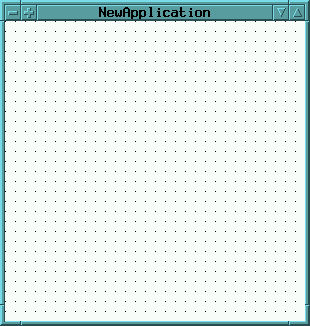
The Application Window (canvas) represents the top view of the GUI windows
generated by the GUI Painter.
While definiting a GUI with the UI Painter,
the canvas shows the widgets layout.
It also functions as a drop-target for widgets from the gallery.
The canvases popUp menu provides common layout manipulation and
copy/cut/paste functions.
(these functions are also found in the GUIPainters treeView and
its main-menu)
Notice, that applications may also be embedded into other applications
as subApplications (see SubCanvas).
In this case, the subApplication is defined as if it was a regular
topApplication - however, at startup time, it will be created within
an instance of SubCanvas (instead of ApplicationWindow)
| Label | String | The window-label of the topView. |
| Icon | selector or binding key |
Name of the icon message.
This message is sent to the application and should return a bitmap image, which is used as the top windows icon. |
| Menu Bar Selector | selector or binding key |
Aspect selector or binding for the building
of a menu bar for the application window.
It should return a menu spec. |
| Menu Bar Performer | selector or binding key |
Aspect selector or binding for sending
the messages of the menu bar items to an object.
It should return an object which is able to receive the messages as specified in the menu items. If blank, the application gets the menu messages. |
| Menu Editor | Opens a Menu Editor on the application class and the defined selector. | |
| Vertical Scroll Bar | Turns on/off that the application window provides vertical scrolling capabilities. | |
| Vertical Mini Scroll Bar | Turns on/off that the application window
uses a small vertical scroll bar.
This attributes can only be set, if the attribute Vertical Scroll Bar is turned on. |
|
| Horizontal Scroll Bar | Turns on/off that the application window provides horizontal scrolling capabilities. | |
| Horizontal Mini Scroll Bar | Turns on/off that the application window
uses a small horizontal scroll bar.
This attributes can only be set, if the attribute Horizontal Scroll Bar is turned on. |
|
| Auto Hide | Controls autoHiding of scrollbars.
If on, scrollbars hide themself, if the contents is smaller than the scrolled view. If off, scrollBars never hide themSelf. If set to default, the autoHide feature is controlled by the viewStyle and scrollbars behave "natural" for the operating system. (true for windows, false for most unix-styles). |
| Min Width | Integer (pixels) | The minimum allowed width of the application window. |
| Min Height | Integer (pixels) | The minimum allowed height of the application window. |
| Pick Min Extent | Picks the current extent of the canvas window and sets it as the minimum extent. | |
| Max Width | Integer (pixels) | The maximum allowed width of the application window. |
| Max Height | Integer (pixels) | The maximum allowed height of the application window. |
| Pick Max Extent | Picks the current extent of the canvas window and sets it as the maximum extent. | |
| Use Preferred Extent | Turns on/off that the window application takes its preferred extent from the top component. | |
| BG-Color | Defines the background color of the application
window.
If the checkToggle is on, the background color can be choosen by selecting the desired color. If no color is selected, the application window takes its default background color (which depends on the viewStyle). |
|
| In All Views | If on, the above background color is recursively set in all sub components.
If off, it only affects the topWindows background. |
|
| Escape is Cancel | Only used with modal dialogs:
If on, the ESC-Key will close the dialog as if the cancel-Button was pressed. |
|
| Return is OK | Only used with modal dialogs:
If on, the Return (Enter-)-Key will close the dialog as if the OK-Button was pressed. |
 see document
"The Layout of the Widgets"
see document
"The Layout of the Widgets"
![[stx-logo]](../../../icons/stx.gif)
Copyright © 1998 eXept Software AG, all rights reserved